Dear WeatherCat faithful,
![[wink]](https://athena.trixology.com/Smileys/default/smilewink.gif "Wink")
. . . .
So you are the impatient type and want this sort of graph now, now, now now!! . . . . .

. . . .

Well no, you can't have your wish come true. However, if you are willing to spare a synthetic channel and are willing cut and paste some AppleScript code, you can actually come very close with the very copy of WeatherCat you have installed on your Mac now.
As soon as posted this, my scheming mind pondered what might be done with the WeatherCat
STAT tag. As difficult as it was for an excessively proud man to do, there was no alternative but to crack open the WeatherCat manual and see what tricks were available. As it turns out Stu provided
da' very thing in a
24HRSAGO period you can use with the
STAT tag. You can read up on all the nifty things you can do with the
STAT tag starting on page 209 of the current WeatherCat manual. All I did then was to create a query that returned the temperature exactly 24 hours ago and used the AppleScript interface to the
STAT tag to get the value of interest. The AppleScript code is below.
-- Channel to retrieve temperature of 24 hours ago.
	set Query to "STAT$TEMPERATURE:24HRSAGO$"
	set result to QueryResult
I had to "repurpose" one of my synthetic channels which now looked like this:
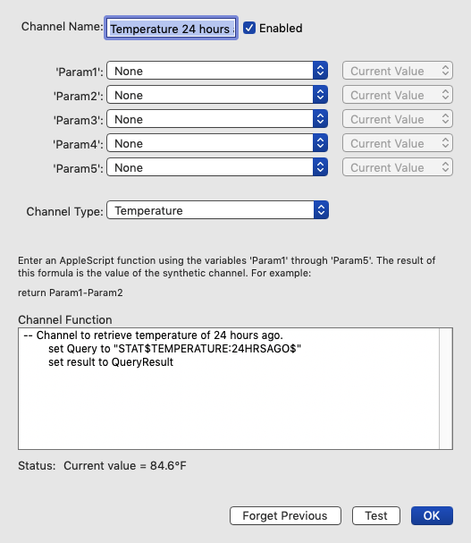
Don't forget to set the channel type to temperature otherwise your graph won't work correctly.
Now all I needed to do is create a new custom graph which looks like this:

The first item to be graphed is the synthetic channel that you just created. You will have to scroll down to find it as the bottom of possible data sources. The second data to be graphed is our usual external temperature. The result will be graphs like this:
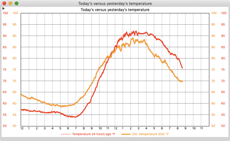
Now it isn't quite what I suggested on 2 counts. It doesn't show you the complete temperature curve for the previous day, only what the previous day had been like thus far in the present day. Also, you cannot be certain the two graphs will be displayed on the same scale. However even with those limitations, I have found this DIY version extremely useful.
My screenshot of the last graph was taken shortly before 9pm. As you can see, the day started considerably hotter than the day before. The overnight lows were around 60° F (16° C) instead of 55° F (13° C). However, at about 11:30am, the curves crossed. The peak temperature on the previous day was 92° F (33° C). The day when this graph was produced peak was a bit cooler at 89° F (32° C). By the time I went to bed things had cooled off much more rapidly then the previous day and I could open the house instead of running the air conditioner.
I've only had it running a few days, but I'm already impressed at how useful it is. The big virtue is that we all have some idea of what the conditions were the day before. This graph quantifies that and helps you make good decisions about heating and cooling compared to how you had handled the situation the day before. Since that is fresh in your mind, it gives you a leg up on what to do.
So if you have a spare synthetic channel (or one you would be will change over) and spend a lot of time fussing with your HVAC system, try making yourself this graph. I think you'll like it!

Cheers, Edouard


