Dear rnbryan, Mark, and WeatherCat troubleshooters,
I've attached a screen shot of a graph with the anomaly.
Thank you for posting the graph. That suggests to me one possible issue although a puzzling one nonetheless. The shape of the graphs reminds me of what WeatherCat displays when there are sensor errors (thus no data.) Here is an example I went through some years ago. First the graph:
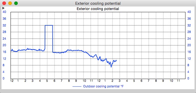
The exterior cooling potential is computed from the external temperature so when there isn't any temperature the graph produces that strange square pattern.
You can confirm this by looking at the
Live Data which is an option on the
Tools menu of WeatherCat. Here is what the Live Data looked like for the outage shown on the graph above:
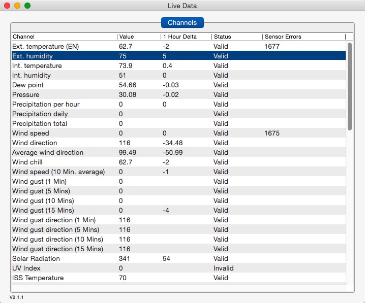
As you can see, while the data is now valid, there were sensor errors for external temperature and wind. During the time when the sensors weren't available, the graph looks like the one above.
If you ever seen this sort of bizarre graph again, definitely check the Live Data to see if there are sensor errors.
Do keep us posted if you uncover anything.
Cheers, Edouard
![[cheers1]](https://athena.trixology.com/Smileys/default/food-smiley-004.gif "Cheers")


